
As a photographer, presenting my work in the best possible way means choosing the right print finish that enhances color, texture, and overall impact. Recently, I tested several print samples from White House Custom Colour (WHCC) to compare different paper types and finishes, and I’m excited to share my findings with you.
Test Prints Overview
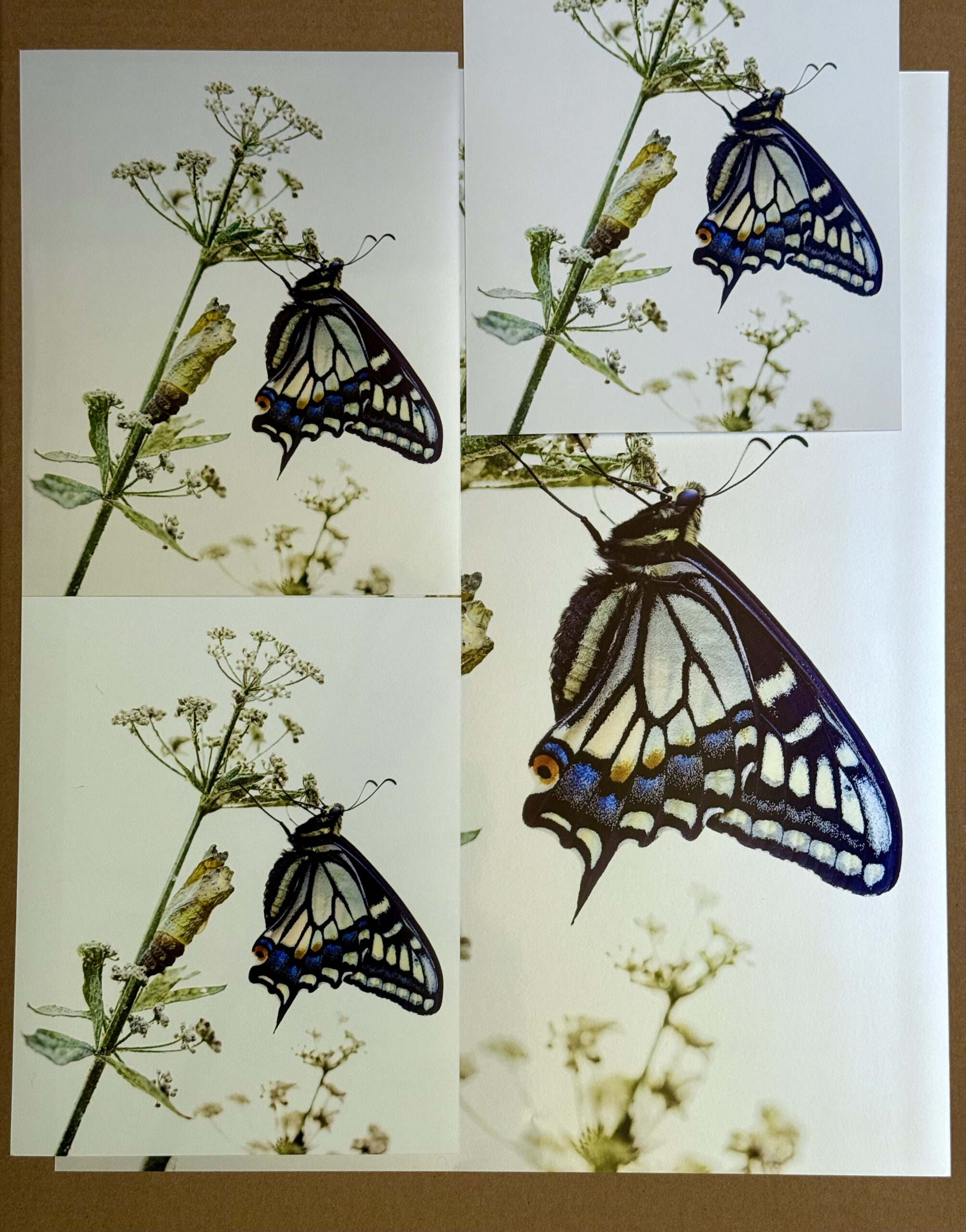
I ordered a set of test prints including three 8×10 prints on different papers and a large 16×20 print with a pearl finish. Each print delivered unique qualities, showcasing how paper choice can dramatically affect the final look of a photograph.
The Pearl Finish: Vibrant and Luminous
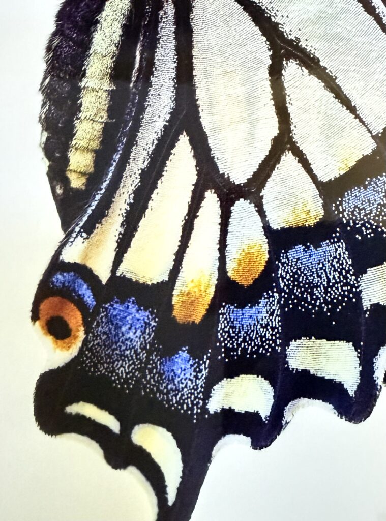
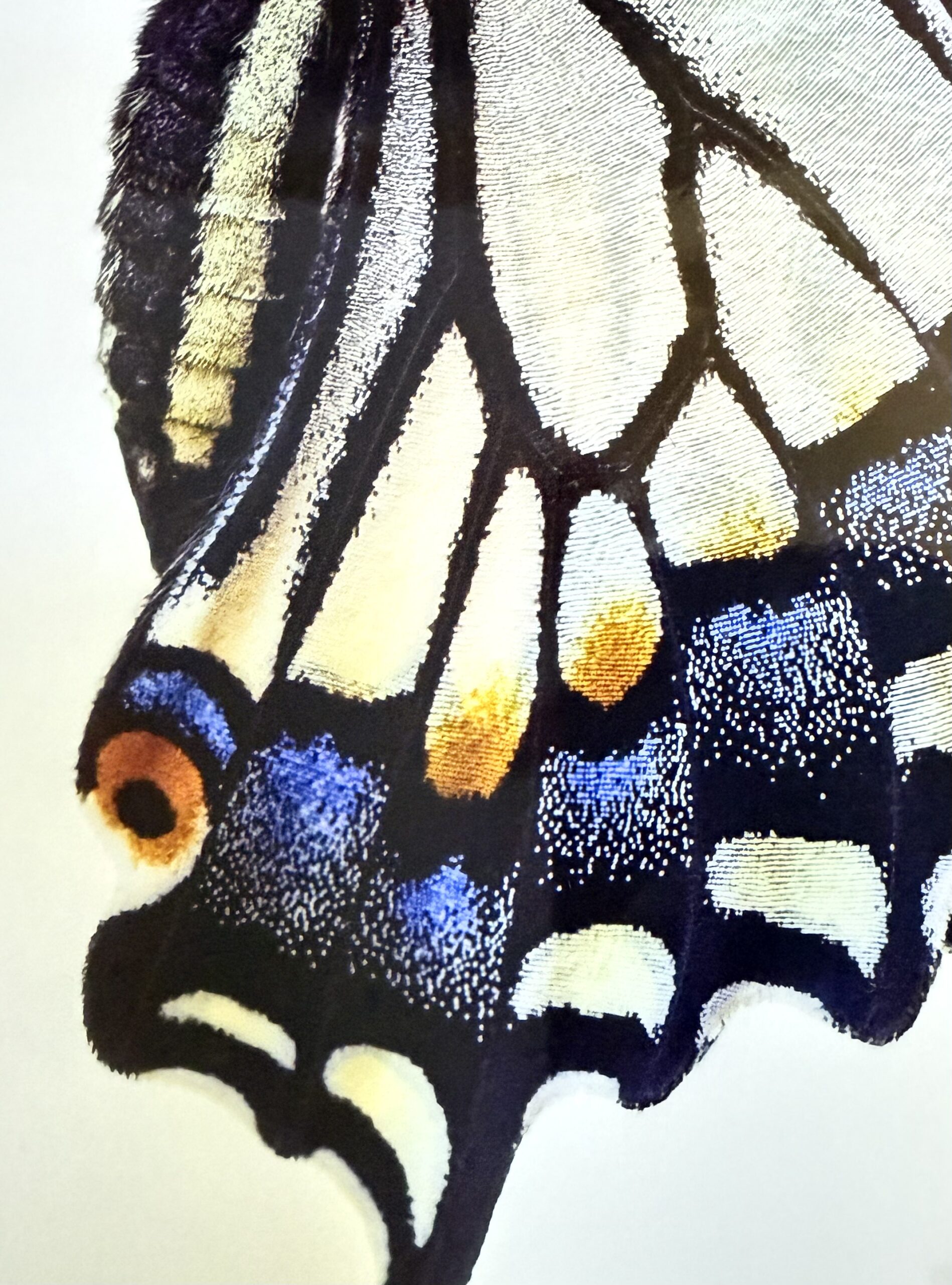
The 16×20 pearl print immediately stood out with its subtle sheen and depth. The finish enhances vibrant colors, especially noticeable in the butterfly image I printed. The slight shimmer gives life to the blues and yellows, while fine details like the delicate wing scales appear crisp and sharp. This finish is perfect when you want colors to pop without the intense glare of gloss.
Matte Finish: Soft and Artful
The deep matte finish offers a completely non-reflective surface that feels smooth and elegant. Colors are softer and subdued, lending an artful quality that is perfect for fine art prints or images where you want to avoid any glare. This finish works beautifully in brightly lit rooms or large wall displays.
Luster: The Ideal Middle Ground
For a finish that balances vibrancy with subtlety, the luster finish (also called satin) is the go-to choice. It provides a soft sheen that deepens colors and reveals details without the stronger reflections of pearl. Luster is highly versatile and works well in various lighting conditions, giving prints a professional and polished look.
Why Print Testing Matters
Comparing these finishes firsthand helped me realize the importance of paper and finish in achieving the desired artistic effect. For example, my previous experience with an 11×14 print from another vendor resulted in dull colors and less sharp detail, which the WHCC prints clearly improved upon.
Sharing the Experience
I highly recommend photographers and artists order sample prints before large runs to ensure the best results. Seeing and feeling the finish in person makes it easier to select what truly complements your artwork.
Get Your Own Prints
16×20 Pearl Print — $78 (Free U.S. shipping, plus sales tax where applicable)
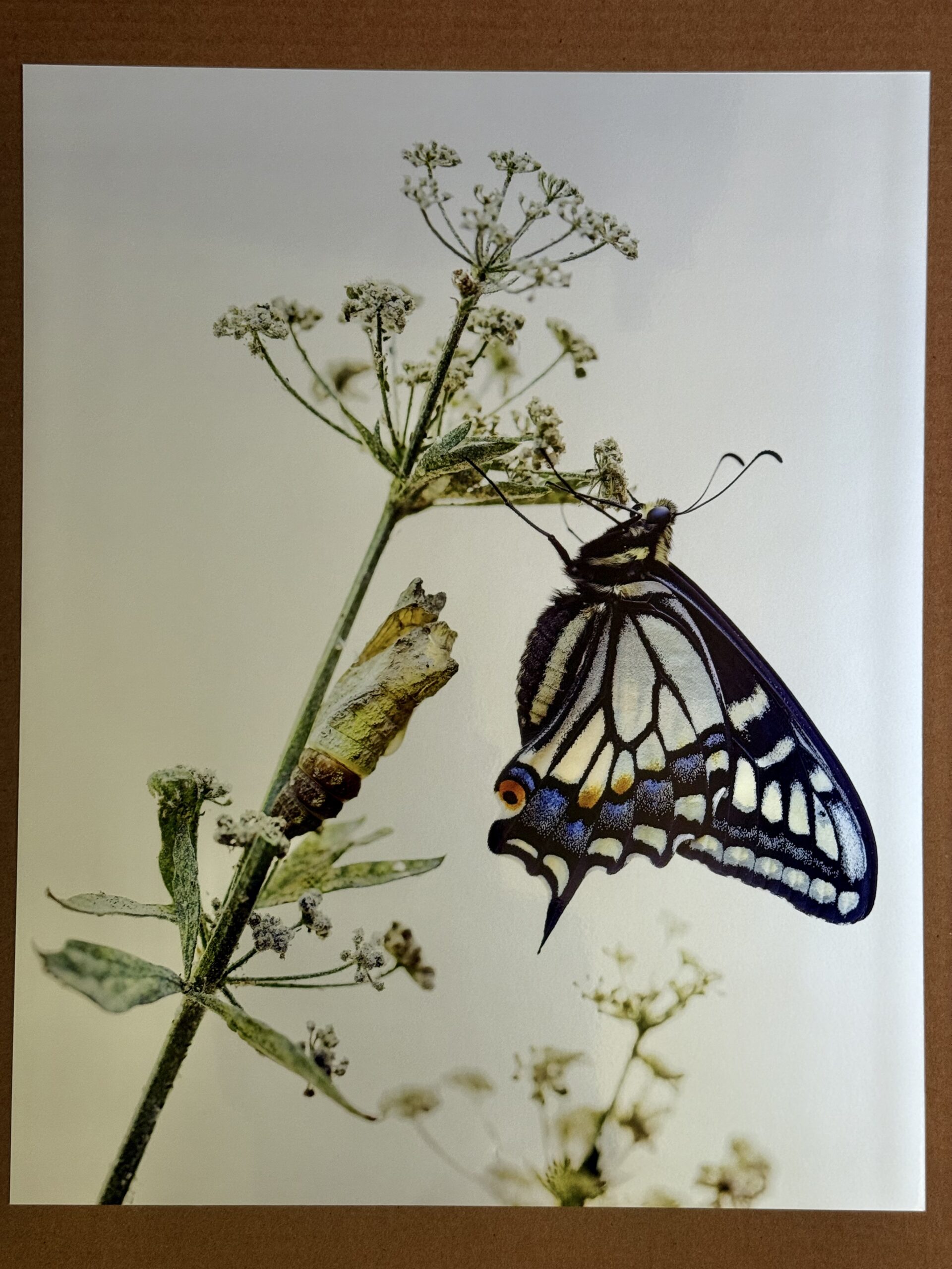
Discover the magical moment when this butterfly emerged in my garden.
Read “Born at Noon” →